ABOUT THE PROJECT
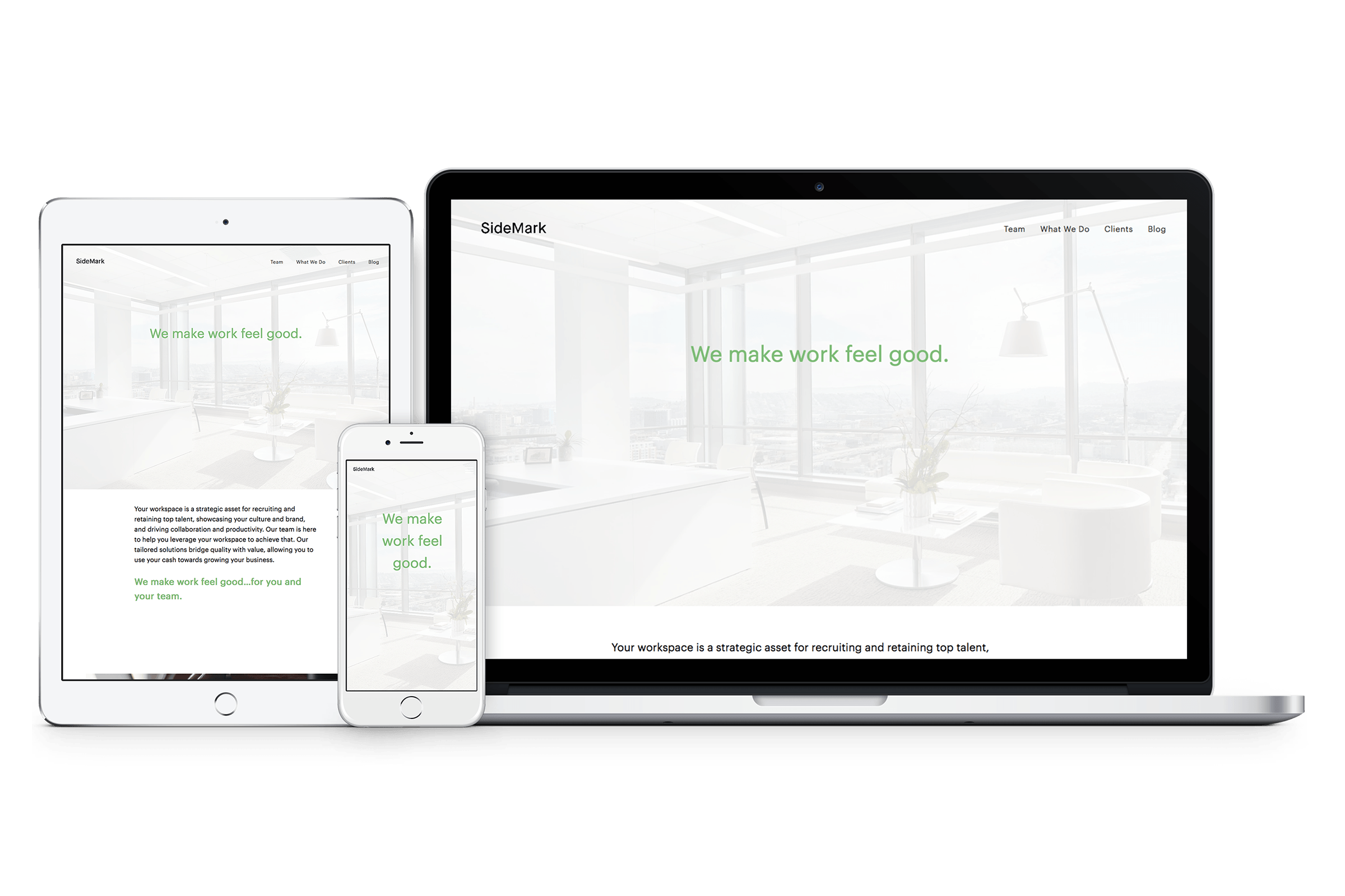
SideMark was on a rebranding campaign beginning with logos, fonts, and colors to set up their new identity. When the owners picked the final design, SideMark needed to rebrand everything they had. My old Marketing Manager Karen Huang provided an outline on how the site be mapped out as well as access to the new platform (Squarespace.com) for me to get started.
CHALLENGES
Since I never used Squarespace before, I didn't know what it was capable of. I had to take some time to understand the user interface so I know how things behaved in there. Once I understood how things worked, I chose a template and began dropping elements on the homepage. I used that as a template for all the other subpages. There was some difficulty on how the template behaved like the overlay over the hero image couldn't turn off on a single page. I tried finding a solution like injecting HTML but it didn't work. However, those challenges helped me understand the platform better.
DESIGN CHOICES
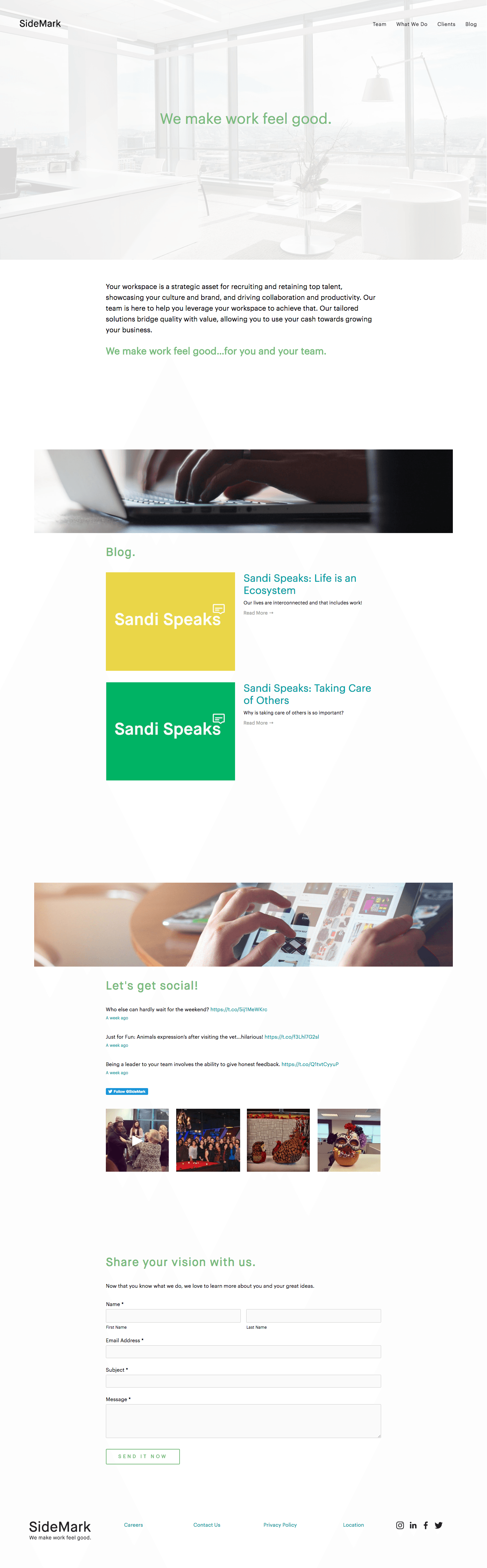
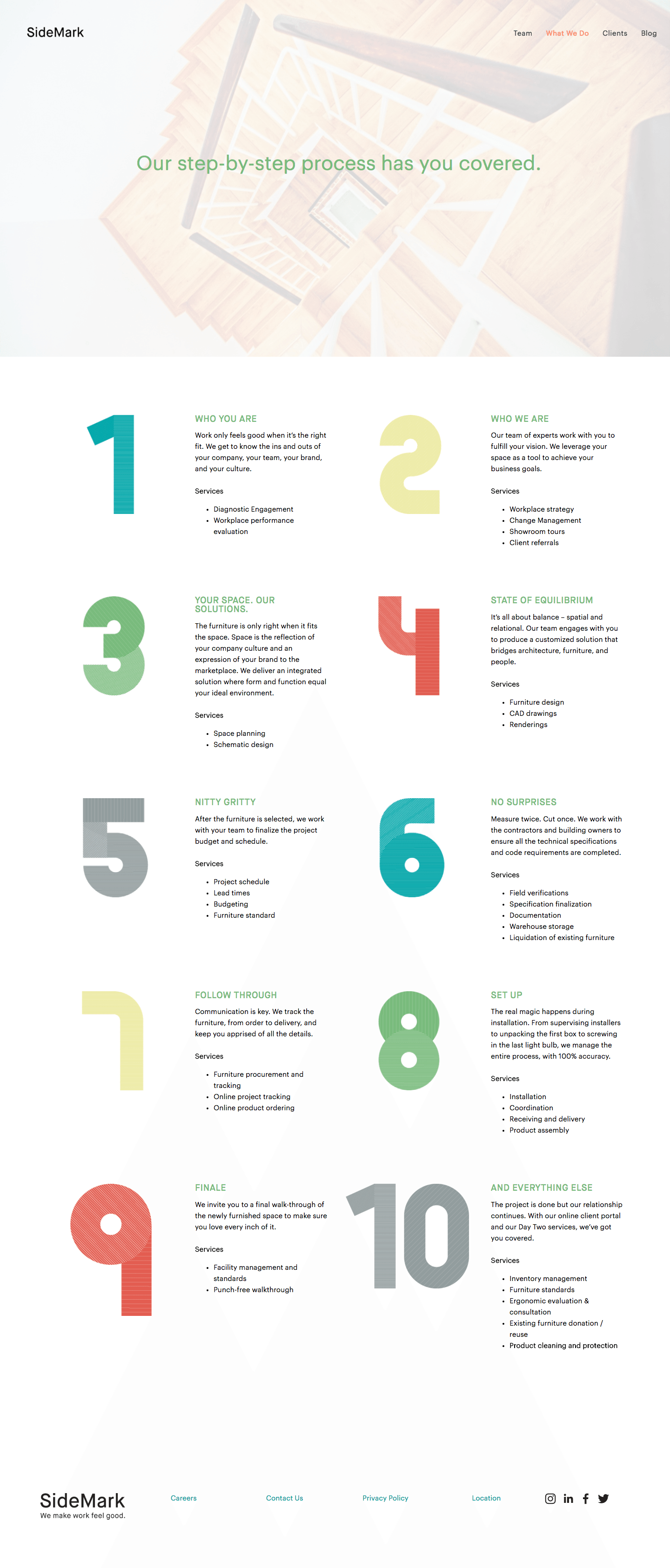
Every page features all 4 colors of the SideMark brand. Page elements like navigation links are also using the brand colors. Links on its normal state would be using the teal color and when a link is in its active state, it would be using the terracotta color. Depending on the content, each page would feature a one, two, or three column layout to keep the content organized and easy to read.

INTERACTION
The 'Clients' page is a thumbnails page with many projects that SideMark has done over the history of the company. Each thumbnail takes you into the project gallery. Within each project page, there are links that was created at the bottom of the gallery of photos so that a visitor won't need to scroll up to get back to the 'Clients' page either to look at the next project or just exit the gallery.